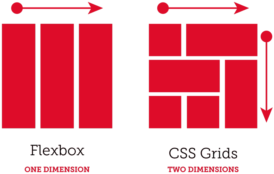
Flexbox and CSS Grid have both provided web property developers with more convenient ways to do website design from scratch. The amount of control that they give to developers, particularly when customizing and styling complex web pages, is unprecedented and instrumental. More importantly, both these platforms are vital for ensuring that your website would always be able to adhere to responsive design guidelines.
Often, comparisons are made between CSS Grid and Flexbox. While there are noticeable differences, what’s sure is that both are reliable and actually work extremely well if used together.
Advantages of Flexbox & CSS Grid
Avoids dependence on third-party libraries
CSS Grid and Flexbox were invented and developed to overcome a major hurdle prevalent in standard CSS layout system: the overreliance on third-party libraries. These libraries were often used to make up for the features that web developers have found to be lacking in the system. These third-party libraries were usually utilized to perform steps that are practically no longer needed to be done thanks to CSS Grid and Flexbox.
CSS Grid, after all, has its own grid layout system, which basically makes it easier for you to modify your own website design studio without having to go through lengthy processes. In short, it streamlined web development as a whole, which also happened to carry a perk of faster loading of web pages (there’s no need to load any additional code, after all).
Facilitates design tasks
Whether you want to perfect the symmetry of your website’s various elements when it comes to aligning or apply site-wide layouts, Flexbox and CSS Grid would make it extremely easy for you to do most of your standard designing endeavors.
Furthermore, you won’t be needing to write a lot of code anymore, allowing you to perform tasks more quickly and just makes your work that much easier to organize.
Are you the type of developer who tends to modify layouts every now and then? If yes, then know that you can do this fairly easily with both these platforms. The same can be said for other essential tasks like prototyping.
Future-proofing abilities
The efficiency of Flexbox and CSS Grid could not be more apparent in the fact that these two are being touted as the best platforms for web development now and in the long term. They are, as of this writing, without competition. This speaks volumes about the kind and level of innovation that they brought to the field upon their inception and introduction. This is also the reason why learning them are worthy investments that would allow you to build a solid foundation for your career as a web developer.
Increases developer productivity
What could be more important for a web developer than the amount of high-quality output that he can produce in a given amount of time? With Flexbox and CSS Grid, increased productivity is pretty much assured because both are able to swiftly deliver tools to developers, which they can in turn use to solve any immediate and long-term problems that they have.
Almost all developers tend to rely on short-term solutions to their problems. To do this, they often introduce code that would only solve a particular problem. The issues that arise from this often range from more unnecessary expenses and a layout that is simply harder to manage and modify.
With the help of CSS Grid and Flexbox, you won’t have to rely too much on these lengthy and complex codes just to perform something as basic as aligning the elements of your web pages. You can only imagine the amount of time that you would be able to save with this kind of advantage.
In short, brevity is what’s prioritized in coding, and Flexbox and CSS Grid can most assuredly deliver it to developers.
Simple to learn
Without a doubt, most of us have a yearning to learn something new. However, it would certainly be preferable if it won’t involve going through a difficult learning curve. This could not ring truer for web developers who always have to be willing to learn any innovation that gets introduced in their field. What’s good is the CSS Grid, and Flexbox is not at all difficult to learn. Developers who already have a good grasp of coding can get the hang of it in no time.
Some can attest to the fact that you’ll only need a week to begin using it properly. There are plenty of resources online where you can learn them as well, so there’s practically nothing stopping you from equipping yourself with the knowledge of using the most powerful platforms for website design now and in the conceivable future.
How to Best Use Layouts
Because CSS Grid and Flexbox work well together, it’s highly recommended that web developers capitalize on using them as a tandem in designing a website with responsive design. For instance, in the matter of layouts, you can use Flexbox to make the basic layout of your site (navigation, images, column layouts, etc.) Afterward, you can rely on CSS Grid to essentially perform enhancements to the said layout. CSS Grid, for example, can be used to make the designs of elements such as photo galleries to be more responsive. Of course, this is but one example out of many.
You can also use it to develop a grid layout, for instance, then utilize media queries to fill the said grid with pertinent content. With the advantage of CSS Grid, you won’t have to worry about the content not being rendered properly for the specific device or screen that the visitor would be using. If you want to make sure that they the content of each grid is properly arranged, you can use Flexbox to ensure this.
This is but one solid proof of how well these two work together in helping you develop a web property that would always have responsive design. It isn’t at all surprising that Flexbox and CSS Grid are able to do this as both were created in a time when responsive design is nothing short of vital.