A good web presence requires you to have good content and a suitable architecture for your site. But how do you gauge the effectiveness of your content and architecture? If you’re on the West Coast, looking up UX design agencies San Francisco is one way to do it, where there’s no room for error. But if you’re a bit more curious and want to get your hands dirty, there are other ways of approach.
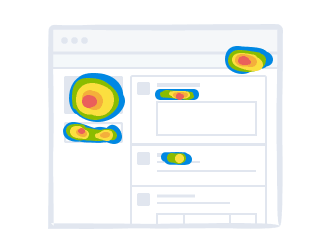
This can help you make informed decisions that can improve the UX design of your site and improve conversion rates. Heat maps are a type of visual representation that shows the activities of users on a webpage. They are in the form of different colors which represent the intensity of activities of users on particular sections of a web page.
Heat Maps Guide
Click/Touch Heatmap
Click maps give information on where users click on your site. In most cases, white and yellow spots represent the most clicks while blue spots show fewer clicks in a click map. Click map data is essential as it can help tell the actual action of users when they navigate your website. This way you can know the best places to place the call to action buttons and new products. Also, you can be able to tell what features your users prefer the most.
Scroll Heatmap
Scroll maps are heat maps that tell you up to which point of your page users scroll down. The number of users and the position to which they navigate can help you in designing a better page layout. A page with a proper page design helps in improving your user experience.
A scroll map data can help you with a number of things such as helping you arrange your content in a way that exposes it to many visitors, placing your CTA in a position where many users scroll and understanding which segments in your page are more appealing to users.
Attention Heatmap
Attention heat maps help to track the amount a user spends on certain areas of your page thereby showing the areas that visitors find more valuable. The areas they spend more time on are more likely to be valuable than those areas on which they spend lesser time. Attention maps are important heat maps for UX design as they can help tell the most interesting areas of your site, the best places to put your call to action buttons. Also, they give you to customize your page based on users activities on your page.
Mouse movement Heatmap
Mouse movement acts as the best alternative to eye-tracking, by checking on mouse movements of visitors to your website. These heat maps help to tell you where users engage with your content by collecting data on users behavior. Some of the questions mouse movement data can answer include, but are not limited to;
Which material are your users engaging with the most?
Which content to improve and distribute for more exposure?
Where to place your advertisements?
Which content are users ignoring?
The advantage of Heat Maps
Heat maps track where your users click on your website. By monitoring user clicks, you are able to tell what your users like the most. It could be the content or appealing visual elements on that part of your page. This can help you enhance the UX design of your website by providing visitors with what intrigues them the most.

Shows areas your visitors do not care about
Beside showing areas that receive the most attention, Heat maps can indicate areas that do not get a lot of attention. This could be because the visitors do not like the elements available on that part of your site or that. You can use this information to optimize your website and improve on the UX design.
There is also a lot of information on your site that users do not find valuable. This clutter slows the performance of your site. Detecting this information using heat maps can help you offload the clutter and improve the UX design of your website.
Draw the attention of users
Heat maps can help you draw the attention of users to areas that you may want. You can either place links and buttons to areas that receive most clicks to direct them to areas that you want. You can also check on elements that people like the most and introduce them to the regions that you want people to visit more.
Organize the navigation on your site
Heat maps can help you detect the pages your visitors click the most. In case it is not the page you intend them to click you can decide to change the buttons. You can put the buttons of the pages you want them to click in areas that receive most visitors.
Help introduce a new element on your site
You may want to introduce a new product on or put an element on your webpage. The best way for the product to have an impact is to place it in the area where most visitors will quickly notice it.
Heat maps analysis can help you decide on the best place to put a new element.
They relay this information using a color representation which each color is representing the attention afforded by visitors in that area. You can then choose an area that receives the most attention based on its color. This way you are able to select the best area to introduce your new element.
Helps in checking the impact of text
You may want to check on the impact a written text on your site has. Heat maps can help you check on whether the text on your is attracting and holding visitors. If the text is not holding visitors, you can decide to change it.
Conclusion
Heat maps provide valuable information to improve your UX design. You should however not rely on them as your only source of information. You can combine heat map analysis with information from other research tools like Google Analytics and web analytics to create a better UX design.