
Whether you’re a professional designer or a brand founder taking on the challenge of creating your company’s identity, crafting a logo that truly resonates starts long before you open a design program. It begins with thoughtful planning — and at the heart of this preparation lies a powerful, often overlooked tool: the moodboard. More than an inspiration collage, a logo moodboard is your visual compass, aligning color, typography, and iconography into one cohesive creative direction.
TLDR
Logo moodboards act as early-stage blueprints that help shape a coherent and visually pleasing brand identity. They bring together essential design elements — color palettes, typography styles, and icon types — to define the overall mood and direction of a logo project. When done right, moodboards foster harmony, improve communication with stakeholders, and streamline the design process. They are a critical step in translating ideas into iconic visuals.
What Is a Moodboard and Why Does It Matter?
A moodboard is a curated collection of visual elements that articulate a desired look and feel. It can include photography, illustrations, color swatches, typography samples, textures, and icons. For logo design, the moodboard becomes a strategic tool that:
- Clarifies creative direction before design begins
- Helps clients and teams align on visual identity
- Provides inspiration and continuity for the final logo
- Reduces time spent on revisions by guiding design decisions early
Without a moodboard, logo design often leans too heavily on trial and error or vague ideas. With one, your creative decisions are grounded in intention and strategy.
1. Choosing a Color Palette That Tells a Story
Color is perhaps the most immediate and emotional component of your visual identity. It sets a psychological tone before a word is even read or an image recognized.
When selecting a logo color palette for your moodboard, consider the following:
- Brand Personality: Who is this brand? Bold and energetic? Calm and professional? Your palette should reflect those traits.
- Color Psychology: Red evokes passion and urgency, blue conveys trust and stability, green suggests growth and sustainability.
- Target Audience: Different age groups, cultures, and industries respond differently to colors.
- Competitor Analysis: Study peer logos to identify gaps — what colors are common, and how can you stand out?
A good moodboard doesn’t just splatter colors across the canvas — it arranges them in thoughtful combination. Include:
- Primary Brand Color
- Secondary/Accent Colors
- Neutrals and Background Colors

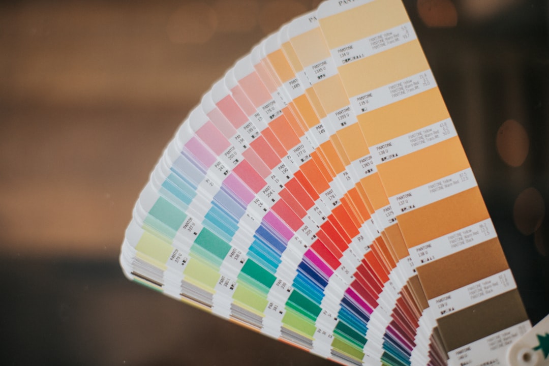
Remember, less is often more. A restrained palette is easier to harmonize and replicate in various formats.
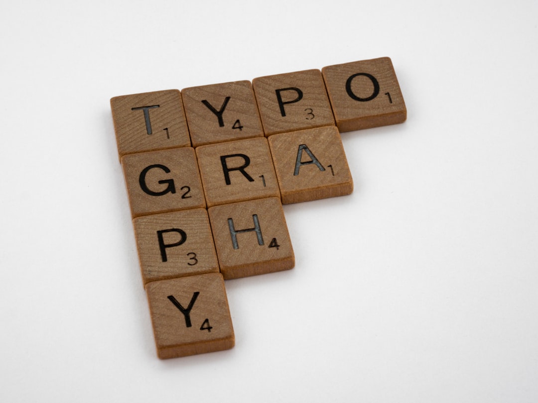
2. Typography: The Voice Behind the Visual
If color is the mood, typography is the voice of the brand. Typography evokes emotion through form, rhythm, weight, and spacing. It plays a central role in logo clarity and personality.
As you gather type samples for your moodboard, ask these questions:
- What personality traits should the font carry? Modern, classic, playful, refined, quirky?
- Should it be serif or sans-serif? Serif fonts usually feel more traditional and confident, while sans-serifs suggest minimalism and modernity.
- How important is legibility? A decorative font may look unique but could hurt readability at small sizes.
- Will it age well? That trending display font may feel fresh now, but think about long-term brand recognition.
It’s a good idea to include 2–3 typefaces or font ideas in your moodboard that feel appropriate and which pair well together if more than one is needed for brand extension. Be sure to show them “in use,” such as in mock logos or headers, to communicate their real-world feel.

Pro Tip: Try not to lock into a specific typeface in this phase. Focus instead on style direction (e.g., geometric sans-serif, soft handwritten, strong slab serif). Give your design room to evolve.
3. Icons and Shapes: A Logo’s Silent Spokesperson
What visual symbol will define your brand? While some logos are purely typographic, others rely on icons as focal points or partnered companions. Finding the right icon style is about more than visual preference — it’s about resonance and meaning.
In your moodboard, explore:
- Form Consistency: Are the shapes geometric, organic, abstract, or literal?
- Line Weight and Style: Do they use thin outlines, bold fills, or custom linework?
- Integration with Type: Will the icon sit beside, above, or inside the text?
Well-selected iconography on a moodboard sets the stage for harmonious composition. More importantly, it speaks symbolically to the values or visions of the brand.
For example:
- A leaf icon may suggest nature, sustainability, or organic products.
- An abstract spiral could imply growth, creativity, or innovation.
- A shield shape can represent strength, security, or trustworthiness.

Alignment matters. Be sure the icons you showcase on your moodboard “speak the same language” as your type and color palette — use consistent angles, vector weight, and energy level.
Putting It All Together: Achieving Harmony
Now for the fun part: assembling your moodboard. In this stage, your goal is not to finalize design components, but to create visual harmony. Each selection — color swatch, type sample, icon style — should look like it belongs with the others when placed side by side.
Here are some layout tips:
- Group similar ideas together (e.g., left section for colors, right for typography)
- Use whitespace intelligently to guide the eye
- Include sample compositions or mockups, like logo-in-context versions
- Limit your selection to avoid visual overload — quality over quantity
Don’t forget to pair your visuals with brief labels or annotations. A few words about why an element was chosen can clarify intention and aid collaboration.
Moodboards: Not Just for Designers
You don’t need to be an expert in Adobe Illustrator or Figma to craft a powerful logo moodboard. Tools like Canva, Milanote, Pinterest, and even PowerPoint can be just as effective for non-designers. The priority isn’t polish — it’s clarity of vision.
In fact, moodboards offer immense benefits for:
- Business Owners: Communicate branding vision more clearly to designers
- Marketing Teams: Align logo creation with broader brand narratives
- Designers: Get stakeholder buy-in early and save time down the line
Final Thoughts
Logo moodboards serve as the foundation of powerful visual branding. By understanding and aligning the three core pillars — color, typography, and iconography — you set the stage for a logo that doesn’t just look great but feels intentional, cohesive, and meaningful. Investing time creating a well-structured moodboard at the beginning of your project is a small step that yields big creative dividends.
So next time you’re about to design a logo, resist the temptation to dive straight into shapes and fonts. Build a moodboard, and you’ll be rewarded with clarity, direction, and a brand identity that truly resonates.