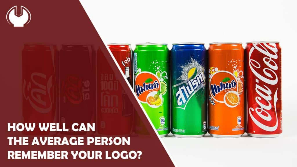
When you have a new business or just one that is not performing as well as you’d like, it can be easy to blame things like your logo for underperforming and not doing its job bringing in the customers. Everyone wants a logo like Nike, Adidas, Coca-Cola, Ikea, Target, or Starbucks, but there’s a funny thing about the logos of those brands that most people never realize.
Even the mega-brands suffer from logo lethargy. Most people say they remember some logos better than others, but when pushed to recreate said logos with colored markers and a blank sheet of paper, that theory goes out the window.
In 2017, signs.com took 10 of the world’s most recognizable brand logos and put 156 Americans to the test of how well they really knew these popular logos. They called their experiment “Branded in Memory,” and the results were downright fascinating, ranging from perfect memories to some of the most bizarre drawings you’ll ever see.
How does this relate to your own logo troubles? The point is to be patient and not expect your business to conquer the world anytime soon. Whether you’ve reached out to a community like Hire the World to aid in your logo design or you’re building one internally with help from your own staff, the world’s perfect logo has yet to be created.
Ikea
The quirky Swedish furniture store has a blue rectangular boxed logo containing a yellow oval with blue block capital letters spelled out inside. Of the 156 people polled, 30% drew a near perfect drawing, getting the color patterns and shapes perfectly, along with the capital letters – that’s about 47 people spot on. On the flip side of things, a full 41% completely ignore the blue rectangular background, only including the oval. Another 14% had the wrong brand colors, including a few reds, several oranges, and one pair of black speakers that sort of defy logic.
Apple
Apple is one of the most popular computer brands in the US, starting the PC craze alongside IBM in the early 1980s and moving into its Macintosh lines, then the i-series of pretty much everything in the last 20 years. At the time of the study, Apple was favoring its silver/grey look. Just 20% of people drew Apple to near perfection, far fewer than Ikea’s. A full one-quarter didn’t include the fruit’s leaf, while 31% drew a stalk that is not in the drawing. The company can take pride in how many people remember its rainbow-colored logo of the 1980s, and it popped up at least a dozen times. Meanwhile, 22% drew the apple facing the wrong way, and 16% forgot to take the “bite” out of it.
Adidas
Adidas regularly battles for second place in foot apparel in the US with Reebok, with both brands trailing Nike by a substantial margin. The current logo for the German-born company consists of three black stripes at an angle with the word Adidas underneath. Only 12% of the 156 – fewer than 19 – drew it completely right. An equal number drew the company’s trefoil logo that has not been used in two decades, while another 21% wrote adidas in title case, which has never been the case (pun intended). The number of stripes threw lots of folks off as well; 11 % had at least four stripes in their drawings, while others went with rainbows, waves on the ocean, something resembling a railroad track, and our favorite – an orange shoe sitting all alone.
Fortunately, customers don’t have to recreate their favorite brands in order to be loyal and make purchases. It is a good reminder that the brain is not perfect and can’t be expected to remember everything for the next time you get focused on your target audience’s struggles to remember who your company is.
