Themes
Depending on the license you have purchased, you will have a specific number of themes available to use with Coming Soon & Maintenance Mode PRO. The themes are actually templates that you can use to edit & design a page of your own quickly.
To get access to themes, please go to Settings -> Coming Soon PRO -> Themes.
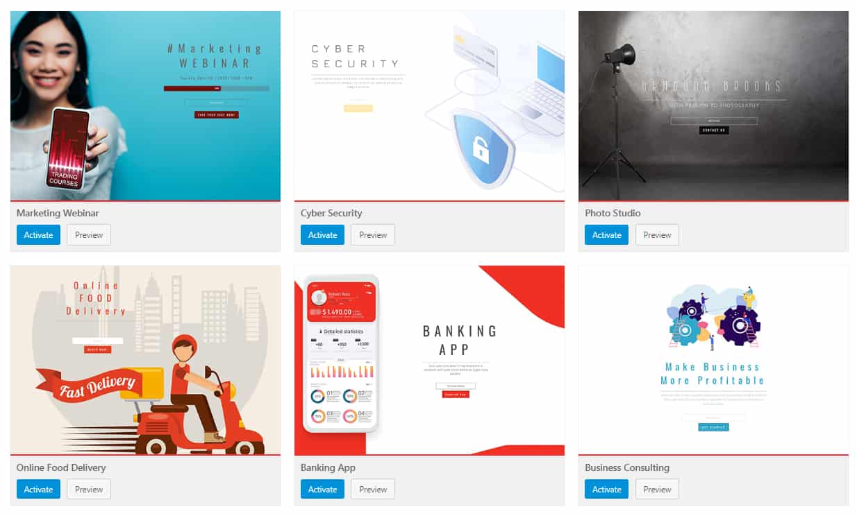
This page will show you all the available themes you get to use. Here, you can browse through the list, preview each theme, and activate the one you like the most.
After activating the theme, you will be able to modify it to the very detail – from changing images and content to adding videos, modifying colors, fonts, etc. All themes are fully customizable, and it’s only up to you to decide how to modify them to your needs.
When it comes to themes, you can always
- Create a new theme
- Modify an existing theme
- Use a custom page/layout
IMPORTANT: Before activating a new theme, make sure that you have saved changes to the old one (if you worked on one already). Customizations you made on the current design will be lost as soon as you activate a new theme. This does not affect your regular WordPress theme or settings on your site.
How to Create a New Theme?
Usually, creating new themes would require you to start a new page that you can later modify. With Coming Soon & Maintenance Mode, creating a new theme is even simpler than that.
How to Add a New Theme?
- Go to Settings -> Coming Soon PRO
- Click on the Design settings page
- Start adding modules via the Layout
- Modify the visible modules to your likings
- Click the “Save Changes” button at the bottom of the page
- Choose the name of your new theme
Your newly created theme can always be accessed by going to Themes -> User.
Can I Modify an Existing Theme?
Yes, you can choose any of our premade themes and modify them.
With more than 170 templates you can choose from, there’s certainly at least one that will fit your needs. So, instead of designing a new layout, you can quickly modify an existing one, add your custom content, and set the page to on in a matter of minutes.
Please note that at this moment, the new theme is loaded. So, the Design page will show you which modules are used by this time.
To know that, look for the “eye” icon next to a module. The “eye” icon shows an active module, while inactive modules have the “eye” icons crossed out.
-
- Click on an existing module
- Change & save settings
Of course, you can modify the existing template by adding new modules as you wish and treat it as a new theme.
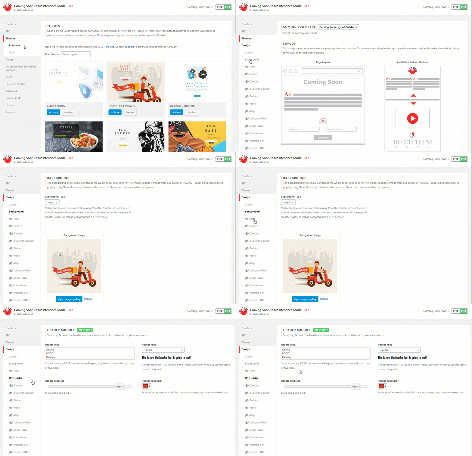
At any time, you can preview your current changes by clicking the “Preview” button on the bottom of the page. You can also Save the theme so you can access it later with these changes.
How to Edit a Theme?
- Go to Settings -> Coming Soon PRO -> Themes
- Choose a theme you like, click the “Preview” button to see it in action
- Click the “Activate” button to make the current theme active and confirm
- Open the “Design” page
What if you want to use a different page builder?
No worries! If you don’t want to use the Coming Soon & Maintenance Mode builder, you can always use 3rd party page builders or even write custom HTML.
Layout
Coming Soon & Maintenance Mode comes with 13 design modules that can be easily arranged on the page via a user-friendly drag and drop editor.
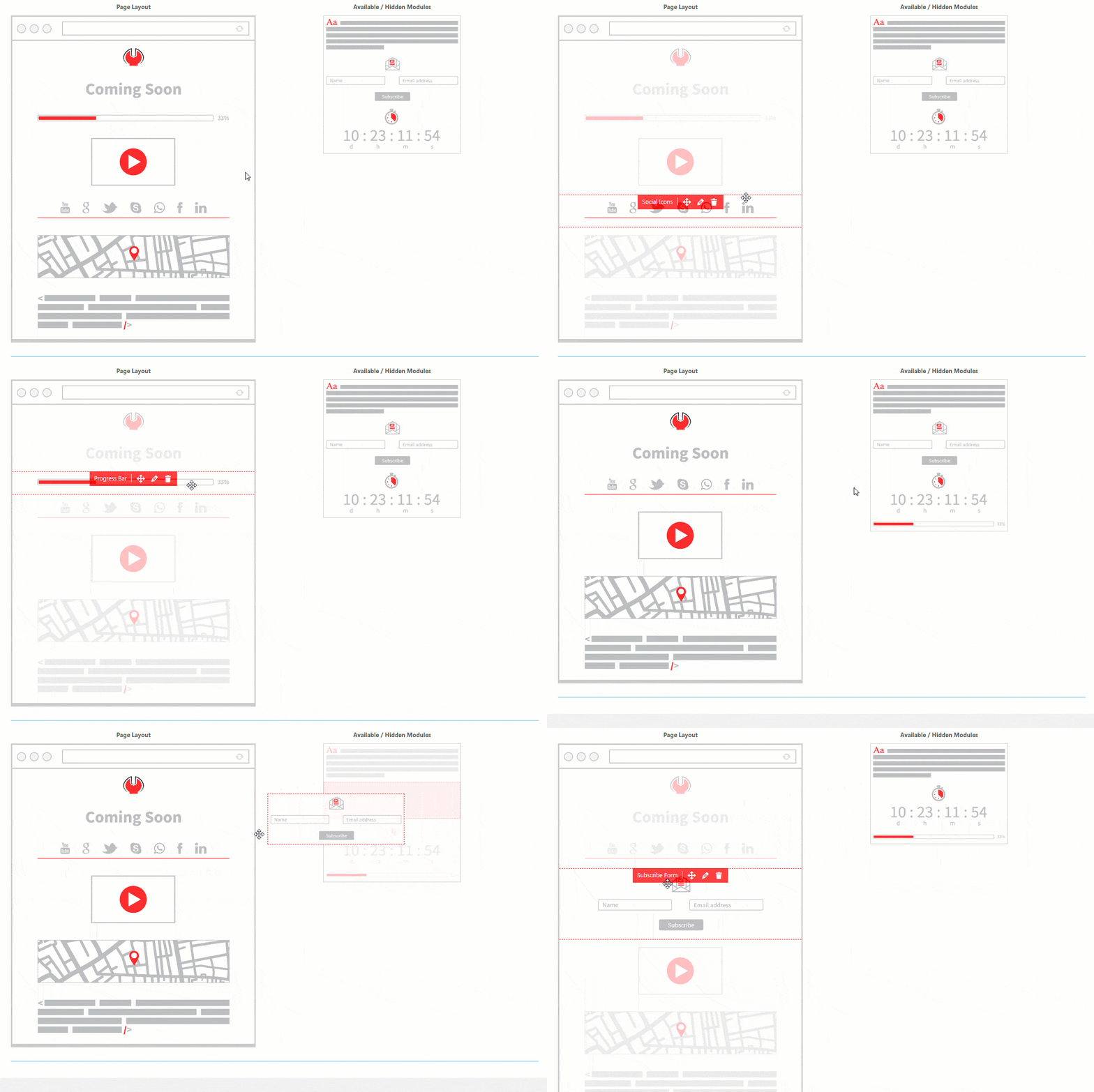
The Layout editor allows you to move modules and choose which one you want to display on the coming soon page.
The Layout editor consists of two columns:
- Page Layout (left)– a column which shows all active modules
- Available / Hidden Modules (right)– holds all modules that you can use but are currently inactive (not visible on the live page)
In order to rearrange modules, simply click on a module that you like and drag it to a place of choice. You can move modules up and down the column and choose their order, but you can also drag them from one column to the other and thus make one available or hide it from the page.
Page Layout
If you put the mouse cursor over any module, you will see a few icons pop up:
- Name – Label with the name of the module
- Drag&Drop icon – allows you to move the module (change the position of the element or move to the inactive list)
- Edit icon – takes you to the settings page where you can customize details of that particular module
- Delete icon – moves the module to the list of inactive modules so you don’t have to drag and drop the element manually
Available / Hidden Modules
If you put the mouse cursor over any module on this list, you will see:
- Name – Label with the name of the module
- Plus icon – add the module to your coming soon page (without dragging it to the desired position)
Content Overlay
If enabled, apply a transparent background to the entire content section of the page. This background is used to put a focus on the content, and you can control its look by changing some of the following settings.
- Content Overlay Color – Click to choose a background color for the content overlay element. You can also write the color’s hexadecimal number.
- Content Overlay Opacity – Move the slider left/right to change the transparency level of the content overlay element. Less opacity means a more transparent background—default: 60%.
- Content Width – Move the slider left/right to change the width of the content that will be displayed on the page. You can choose a width from 200px to 1040px in steps of 10px. Default: 600px.
- Content Position – Choose the position of the content box on the page. It can be displayed in:
- Top Left
- Top Center
- Top Right
- Middle Center
Modules Spacing
The vertical spacing between design modules in pixels. The selected value is added to both the top and bottom margins of the module. Default: 10px.
Custom Layout (Use any Page Builder)
If you do not want to use one of the premade themes or create a new one using the Coming Soon & Maintenance Mode Builder, you can always go with a custom option.
There are two different ways to create a custom coming soon page.
Choose a Page
Create a page by using your favorite builders like Gutenberg, Elementor, Divi, Beaver Builder, Oxygen, Visual Composer, or any other. Then simply select the page you have created and set it as the coming soon page.
- Go to Settings -> Coming Soon PRO
- Select Design -> Layout
- On top of the page, choose “Coming Soon Type”
- Set it to “Existing Page”
- From the dropdown menu, choose the page you have previously created
- Save changes
Use Custom HTML
If you already have a custom-built page in HTML or want to create a new one, Coming Soon & Maintenance Mode lets you do that.
- Go to Settings -> Coming Soon PRO
- Select Design -> Layout
- On top of the page, choose “Coming Soon Type”
- Set it to “Custom HTML”
- Write your HTML
- Save changes
The module is wrapped in CSS classes like all other modules when displayed: .html-container and .mm-module.
If you only need one module with custom HTML, please check how to use one.
Background
The background image makes or breaks the whole page. Usually, this image is the first thing your visitor will notice after opening a coming soon page.
You can choose any image you want that will be displayed as a background and, hopefully, catch the attention of your visitors.
Take your time to choose a perfect image from our gallery of 1mil+ free images and then make it pop by using filters. If you don’t want to use a picture, we added an option that will let you select a background color instead. Or you can go for a video background as well.
Choose one of 1mil+ free images or upload your own.
How to Select a Background Image?
- Go to Settings -> Coming Soon PRO -> Design -> Background
- Click “Open Images Gallery” button to select or upload an image
- Search for images on Unsplash or Depositphotos directly via the plugin Media Library, or upload one from your computer
- Save changes
Background Image Size
Once you have selected an image, you can change its size:
- Auto – display image in original size
- Contain – resize the image so it’s fully visible
- Cover – resize the image to cover the entire screen in any resolution/device
Background Image Position
If defined, the position defines the screen and image corners that will be aligned. It works best with the “cover” size option.
Background Color
If you don’t prefer to use a background image, you can choose a color that will be used instead. Choose any color via the color picker or write/copy the hexadecimal number of the wanted color (i.e.. #fefefe).
Add Background Video
In modern times, where the Internet connection speed is usually not an issue, having a video instead of an image could do wonders.
Before adding your own video background, check out some of our premade themes that come with a video background:
- Metrics Video
- Business Meeting
- Writing Service
- Clouds
How to Add a Background Video?
Instead of images and colors, you can select a video as your background.
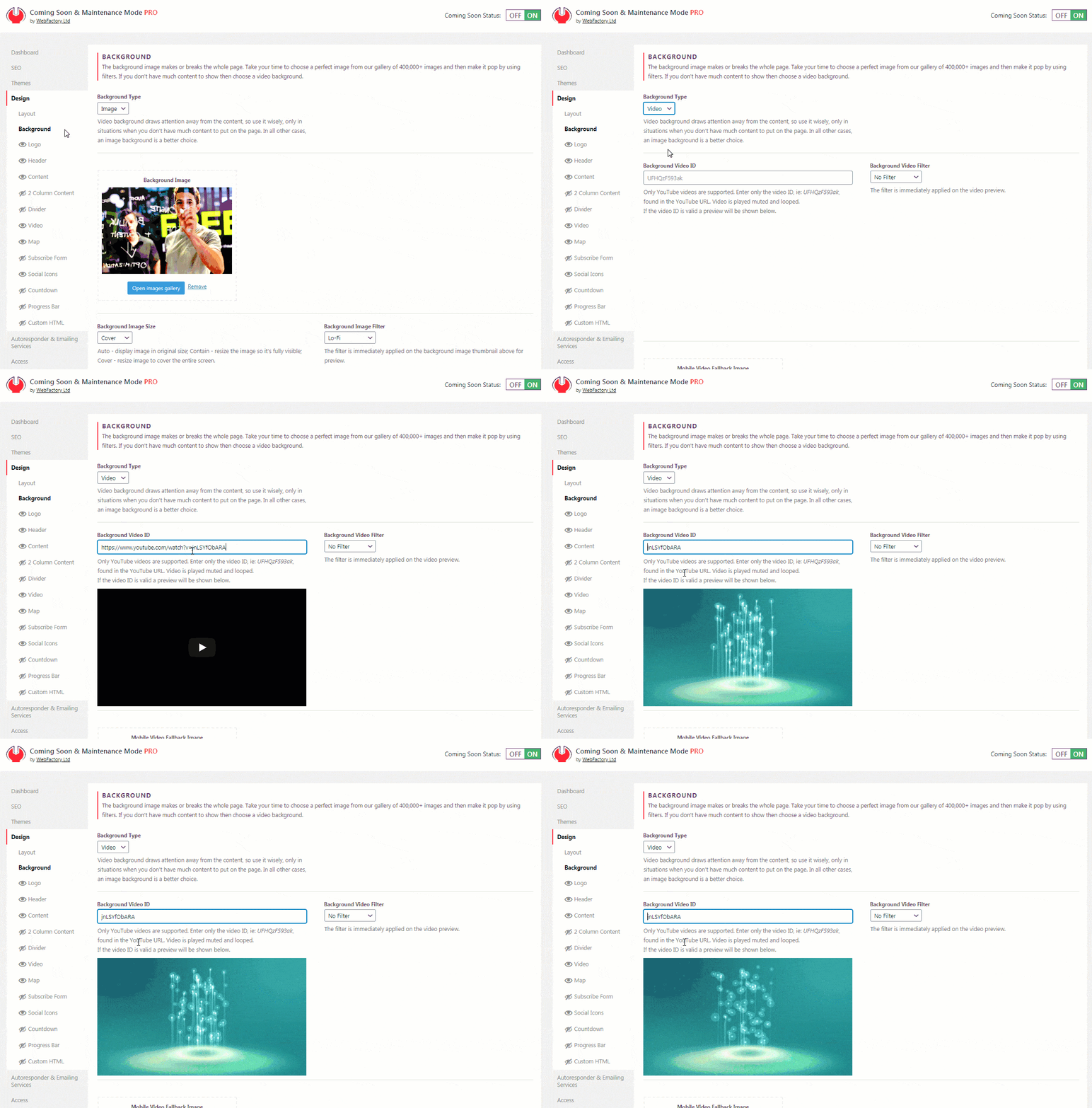
Currently, only YouTube videos are supported. The video is automatically set to play muted and looped.
- Go to Settings -> Coming Soon PRO -> Design -> Background
- Click the “Background Type” button and choose “Video”
- Copy the ID of a video from Youtube
- Paste the ID into “Background Video ID”
- Choose a filter if you want to
- Save changes
Background Video Filter
Just like with image backgrounds, you can apply an Instagram-like filter on a video as well.
That gives you an additional 27 versions of the same video, where you don’t have to know anything about video editing. Simply select the Filter you like and watch the video thumbnail change.
Mobile Video Fallback Image
Unfortunately, video backgrounds can’t play on mobile devices.
Instead of showing an automatically generated screenshot from YouTube, we suggest that you select a fallback image. This image will be displayed instead of the video in all situations where the video does not load.
This can be any image you want. If you want to keep the same style, you can create a screenshot from your video or go for an entirely different image that will fit smartphones and tablets better.
Logo Module
If you’re running a company or maintaining a brand, then you’re familiar with the importance of the logo as a visual representation. Branding is important from day zero, so make sure you display your logo properly on the coming soon page that you have started building.
Because of its importance, we have dedicated the entire module to setting up and displaying a logo.
How to Add a Logo?
- Open Settings -> Coming Soon -> Design -> Logo
- Click “Choose an image” button
- Select your logo from the Media Library or upload a new one
As soon as you select the image file that represents your logo, you will see its thumbnail on the Logo Module settings page. Don’t forget to put the logo module on the Page Layout list to make it active.
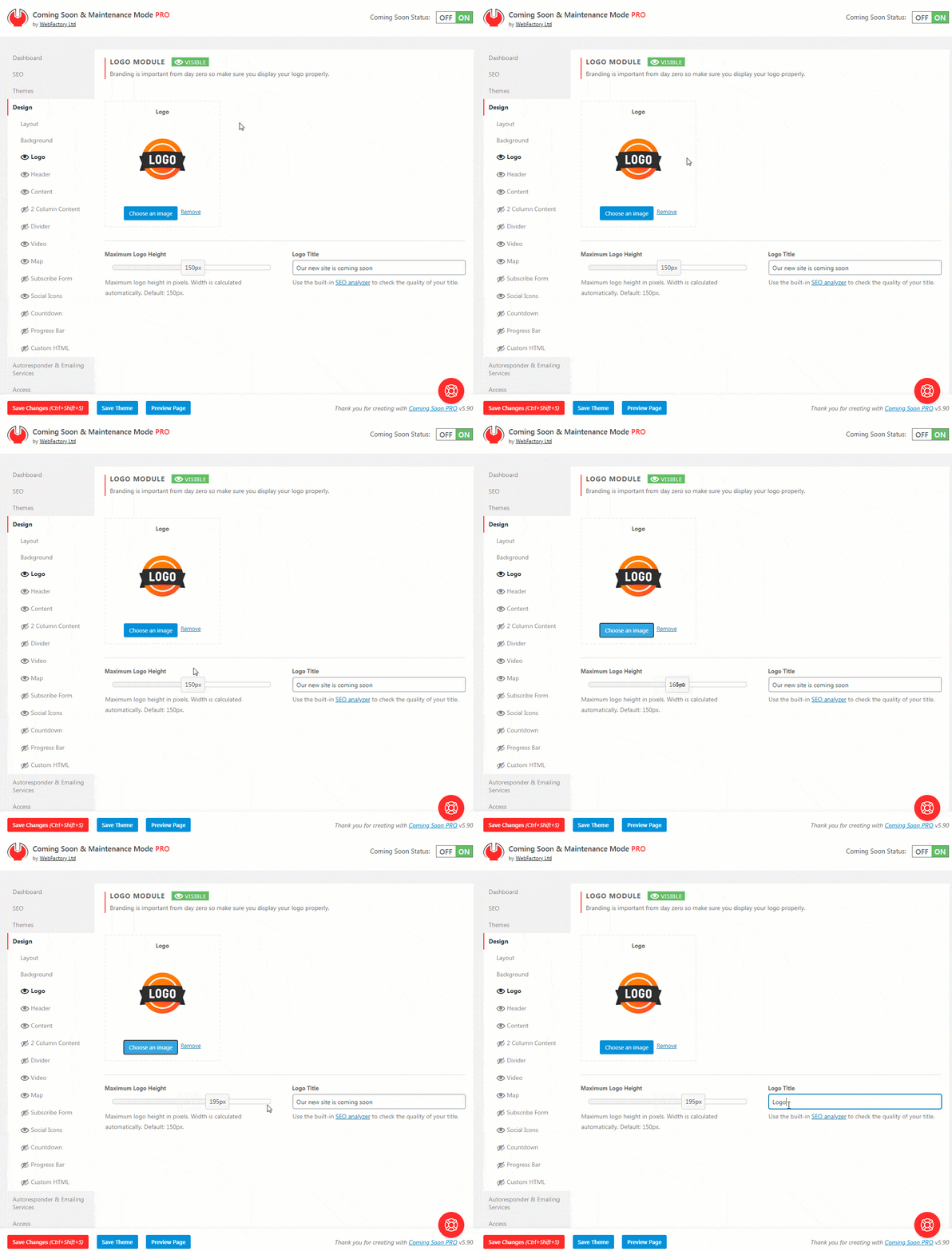
Maximum Logo Height
If the original dimensions of your logo don’t fit for your preferences, you can quickly and easily change its size. Instead of resizing and uploading the image once again, you can change the height of the logo by moving the slider from left to right.
The minimum height you can set is 10px, while the maximum is 300px. Width is calculated automatically to keep the aspect ratio intact. The default is 150px.
Logo Title
Write the title of your logo. The title won’t be displayed, but it will help you with SEO. Use the built-in SEO analyzer to check the quality of your title.
Header Module
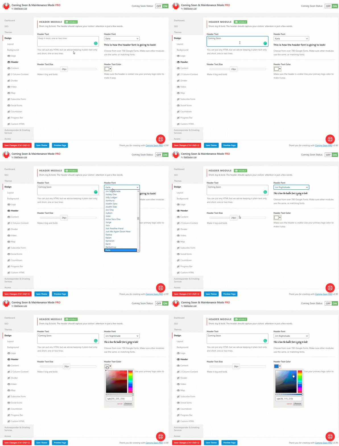
Header Module lets you write a headline. It should be short, big & bold.
Whether it’s the name of your company website or you want to say your website is coming soon, the header should capture your visitors’ attention in just a few words.
If you style it to match your website and logo, you will have a perfect combination that your visitors will love.
How to Add and Customize a Headline?
- Please open Settings -> Coming Soon PRO -> Design -> Header
- Write your headline in the Header Text area
- Choose a font from more than 700 Google Fonts
- Choose its size in pixels; move a slider to select anything from 6px to 50px
- Select a color or write a hexadecimal number of the color you like
- Save changes
Content Module
Writing a quality copy will help your SEO and increase trust with visitors. Try writing a few sentences, even for the most minimalistic pages.
How to Add Content to a Coming Soon Page?
- Go to Settings -> Coming Soon PRO -> Design -> Content
- Use the standard WordPress Visual or Text editor to enter text content (write, add links, create lists, align the content…)
- Choose the font size – use anything from 6px to 50px
- Select the font color, making sure the contrast is good. Whiteish text on a dark background is always a good pick
- Choose from over 700 Google Fonts
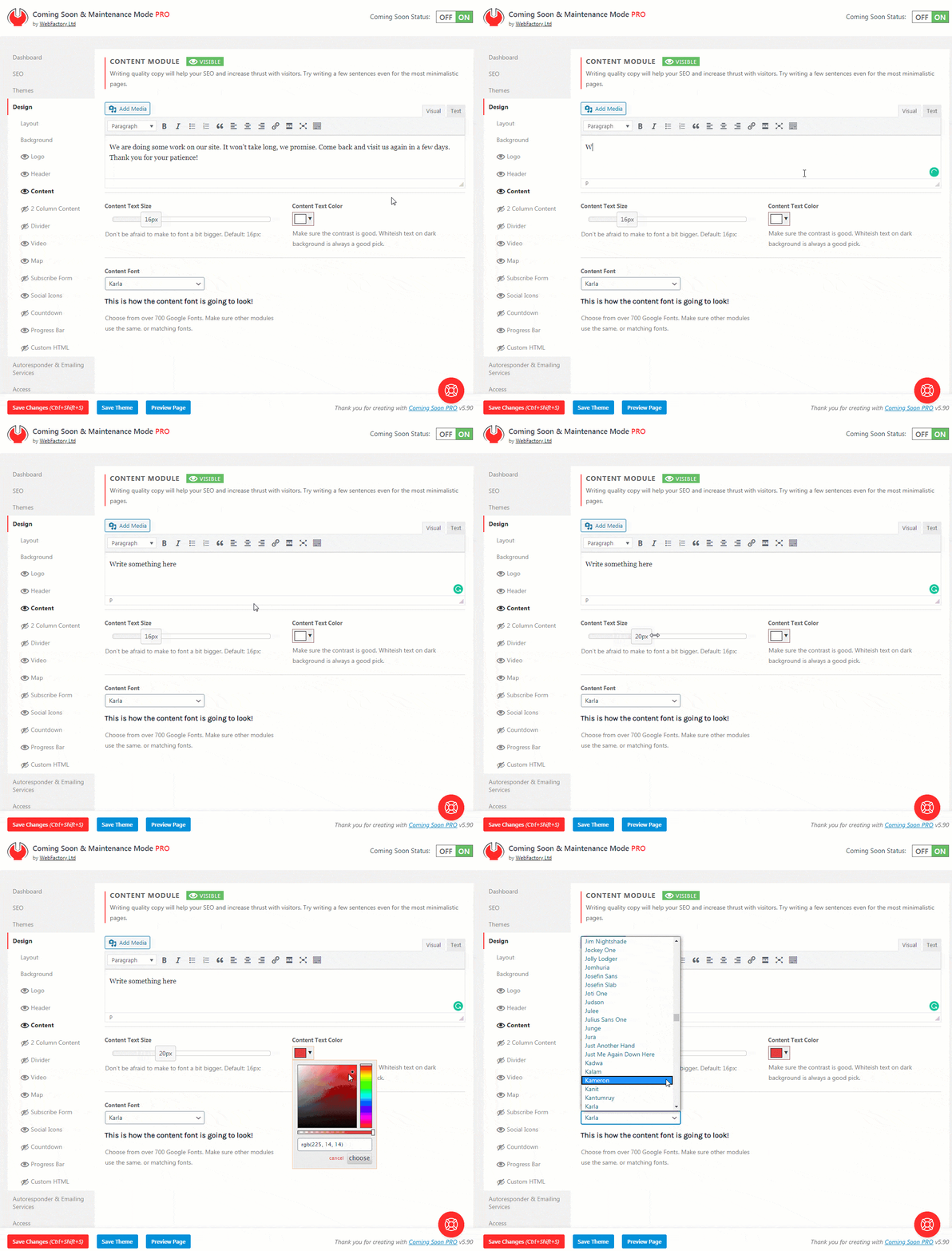
Be creative and write a sentence or two. Although the styling of your content won’t matter much to Google and other search engines, don’t just settle for the first font and color combination. Make the content easily readable and visually appealing. Styling will make a difference, so spare a few more minutes until you reach that sweet spot.
If you know your way around CSS, you can always open Advanced settings and style the content into details by entering custom CSS code.
2 Column Content
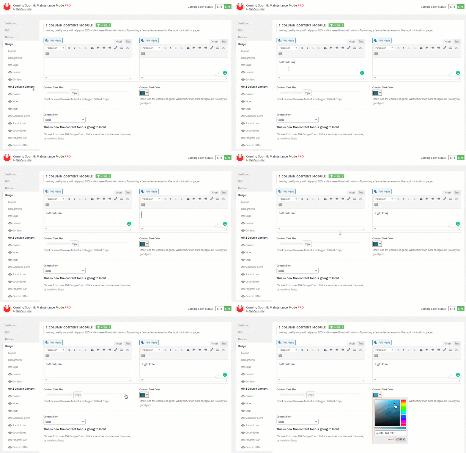
Similar to the Content Column, this module allows you to write text and include images on your coming soon page.
The only difference is that this module lets you have one column on the left and another on the right side.
How to Add 2 Column Content?
- Go to Settings -> Coming Soon PRO -> Design -> 2 Column Content
- Use the standard WordPress Visual or Text editor to enter text content (write, add links, create lists, align the content…)
- Choose the font size – use anything from 6px to 50px
- Select the font color, making sure the contrast is good. Whiteish text on a dark background is always a good pick
- Choose from over 700 Google Fonts
Content Animation
With a simple click of the mouse button, you can choose an animation effect that will bring your content to life.
Don’t worry; we don’t like to exaggerate things, so the animations are as simple as possible. They will affect the entire content at once, which will animate as soon as the page loads in users’ browsers.
How to Animate Content?
- Go to Settings -> Coming Soon PRO -> Design -> Layout
- Scroll down until you find the “Content Intro Animation” option
- Select Animation
- Save changes
And even before you apply the animations to your content, you can test them on our website.
We know you’re interested in what it looks like, so please preview content animations or load one of our themes like:
If you have opened the preview in a new tab and haven’t seen the effect, press F5 to reload the page and watch what happens.
Video Module
Although it’s been years since videos have become an important part of our online lives (mostly thanks to YouTube), the format is getting more popular on a daily basis.
When it comes to web design and landing pages, nothing captures visitors’ attention like a great video! And if you open a few modern websites, you will find that many web designers replace hero images with videos. So why wouldn’t you add one to your coming soon page?
How to Add a Video to Your Coming Soon Page?
Whether it’s YouTube, Vimeo, or any other source, you can feature your video on the coming soon page. You just need to select the video, adjust a few parameters, and you’re done:
- Go to Settings -> Coming Soon PRO -> Design -> Video
- Choose Video Type (Youtube, Vimeo, Other)
- Copy and paste the video ID if you’re using YouTube or Vimeo. Write only the video ID. For YouTube, it’s alphanumeric (i.e.: ScMzIvxBSi4), and for Vimeo numeric (i.e.: 254733356)
- Save changes
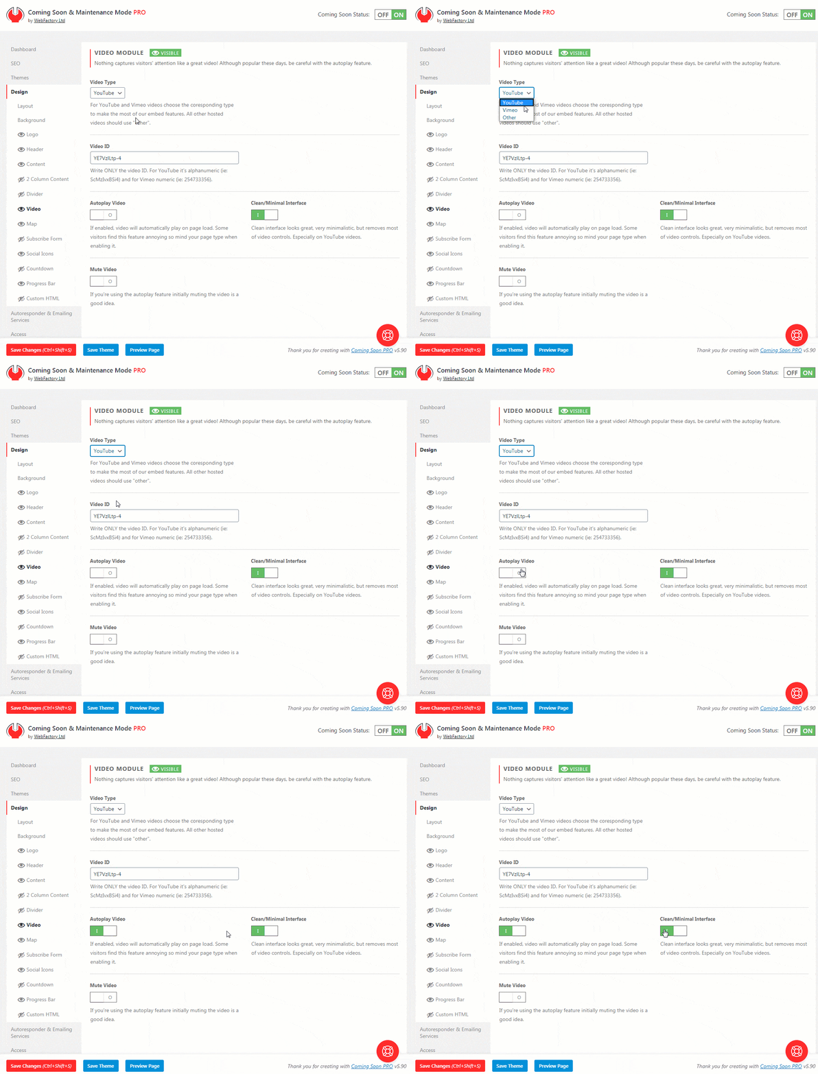
If you are using a third-party video source, copy and paste the complete embed HTML code provided by your video hosting service. It will most probably begin and end with <iframe> tags.
Autoplay Video
If enabled, the video will automatically play on page load. Some visitors find this feature annoying, so mind your page type when enabling it.
Clean/Minimal Interface
The clean interface looks great, very minimalistic but removes most of the video controls, especially on YouTube videos.
Mute Video
If enabled, the video won’t play any sounds. If you’re using the autoplay feature, muting the video is a good idea.
Map Module
Google Maps is a service that doesn’t require a special introduction. Everybody is using it – whether you’re searching for an address or local businesses, using it as navigation, or simply trying to find the nearest pizza place or bar, Google Maps is your friend.
So, if you’re running a local business, you just have to have your address displayed on a map.
Even when your site is under construction or you’re showing a coming soon page, you can still let your visitors know where to find you.
How to add Google Maps to your coming soon page?
Luckily, with Coming Soon & Maintenance Mode, you’re just a few clicks away from displaying a map:
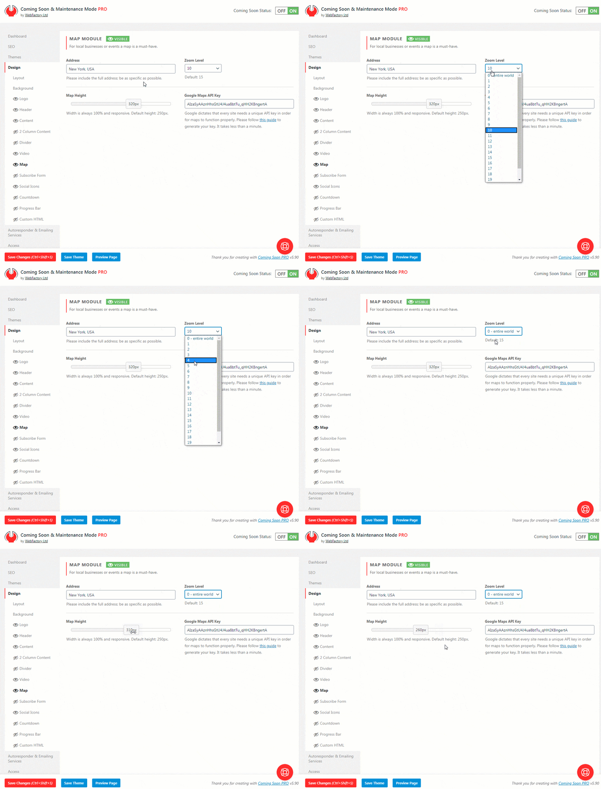
- Please go to Settings -> Coming Soon PRO -> Design -> Map
- Write the address (it can be a specific address or just a city name, for example)
- Choose the zoom level (where 0 shows the entire world, and 21 zooms all the way down to the street view)
- Select the height of your map (width is calculated automatically)
- Save changes

Google Maps API Key
Google dictates that every site needs a unique API key in order for maps to function properly. Unfortunately, there’s no way around this, so please follow this guide to generate your key:
- Open Google Developers Console from this link
- From the dropdown list, choose “Create a Project”
- Click the “Continue” button and wait for a few seconds until Google prepares everything
- You will see the “Add credentials to your project” title -> click the API key link
- Give your API key a name (for example, “Coming Soon Key”), and leave “Key restriction” selected None
- Click on the Create button and copy your API key
- Go to your WordPress site -> Settings -> Coming Soon PRO -> Design -> Map
- Paste your API key and save the changes
Contact Form Module
In order to let people send you an email through your coming soon page, all you need to do is to place the Contact Form Module on it.
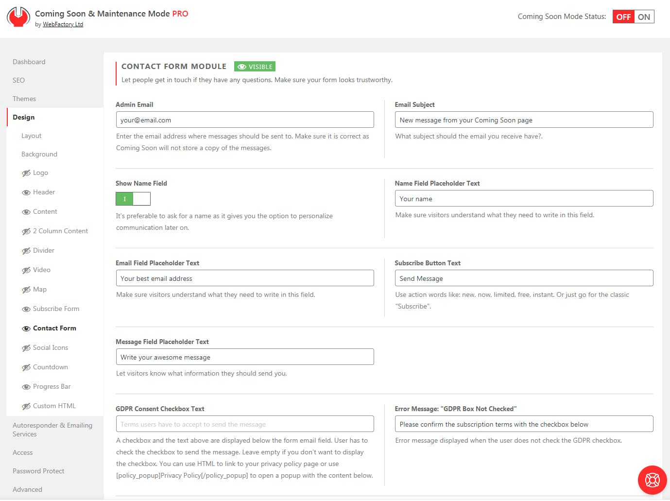
Admin Email
This should be your email address, one where you will receive messages sent through the form
Email Subject
The subject of the message sent through the form. Make it recognizable, so you can instantly know the email was sent via the coming soon page.
Show Name Field
It’s preferable to ask for a name as it gives you the option to personalize communication later on. If you would like to show the field, simply enable this option, and the form will get an extra field.
Name Placeholder Field
Let people know this is the place to write their names.
Email Placeholder Field
If the Show Name Field option is enabled, you will be able to change the placeholder text for it. Write something like “Name” or “Enter your name”.
Subscribe Button Text
Write short text displayed on the call to action button that people will use to send their message.
Message Field Placeholder Text
Text that will be visible on the form field before users start to write.
GDPR Consent Checkbox Text
Write a custom text for the GDPR checkbox and let people know what they’re agreeing to before sending the message.
If you do not want the GDPR checkbox, leave this field empty.
You can use HTML to link to your privacy policy page or use [policy_popup]Privacy Policy[/policy_popup] to open a popup with the content below.
Error Message: “GDPR Box Not Checked”
Write a message that will be displayed to users who do not check the GDPR checkbox.
GDPR Privacy Policy Popup Text
If you want to use GDPR as a popup, write the content here.
Anti Spam Text
Write a text that will let your visitors know that you are not collecting their emails to spam them. Make it custom and personal.
Antispam Text Size
Choose the size of the Anti Spam Text. We suggest keeping it smaller than the rest of the text or at least make it less visible with a muted color.
Subscribe Button Position
The horizontal position of the subscribe button below the email field. It can go left, right, or center.
Antispam Text Color
Choose the color of your antispam text.
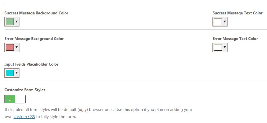
Messages Colors
Input Text Size
Choose the font size for all input fields.
Button Text Size
Choose a font size for the contact us button.
Each response from the form can be colored. You can choose colors for:
- Success Message Background
- Success Message Text
- Error Message Background
- Error Message Text
- Input Fields Placeholder Text
Customize Form Styles
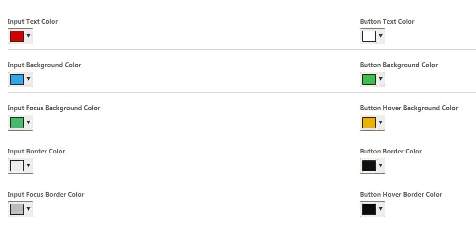
If disabled, all form styles will be default (ugly) browser ones. Disable it if you plan on adding your own custom CSS to style the form fully.
Enable the option if you want to style the form. By enabling the option you will get the following options:
- Input Text Color
- Button Text Color
- Input Background Color
- Button Background Color
- Input Focus Background Color
- Button Hover Background Color
- Input Border Color
- Button Border Color
- Input Focus Border Color
- Button Hover Border Color
To change a color, simply click on the field and select a color from the color picker. If you want to make sure that some colors are the same, copy the color code (for example, “215D3F”) and paste it in another field. Don’t forget to save the changes.
Subscribe Form Module
A coming soon page is a perfect way to announce something or showcase a product even before launch. More often than not, just showing information is not enough – you want to collect leads.
So, display a form on the page and start collecting the first subscribers.
You can configure technical details on the Autoresponder tab, where you can connect MailChimp, Zapier, or any other Autoresponder.
Before you enable the module, make sure the form looks good. To help you with that, we added dozens of settings that allow you to change each and every part of the form without using code.
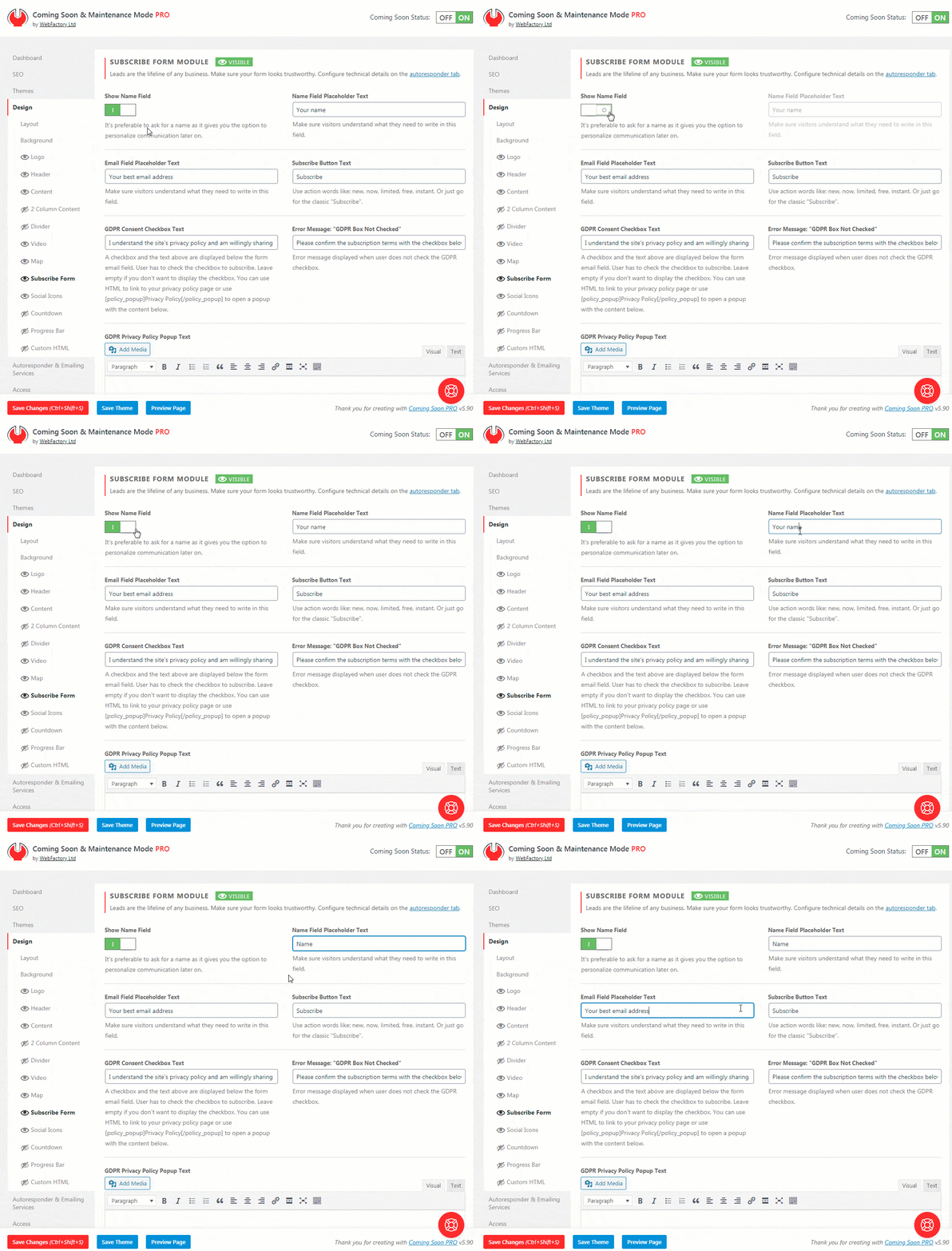
Email Field Placeholder Text
Make sure visitors understand what they need to write in this field. By changing the placeholder, your visitors will know what you want from them.
Subscribe Button Text
Change the text that’s displayed on the subscribe button. We suggest action words like a new, now, limited, free, and instant. Or just go for the classic “Subscribe”.
Show Name Field
It’s preferable to ask for a name as it gives you the option to personalize communication later on. If you would like to show the field, simply enable this option, and the form will get an extra field.
Name Field Placeholder Text
If the Show Name Field option is enabled, you will be able to change the placeholder text for it. Write something like “Name” or “Enter your name”.
Anti Spam Text
Write a text that will let your visitors know that you are not collecting their emails to spam them. Make it custom and personal.
Antispam Text Size
Choose the size of the Anti Spam Text. We suggest keeping it smaller than the rest of the text or at least make it less visible with a muted color.
Subscribe Button Position
The horizontal position of the subscribe button below the email field. It can go left, right, or center.
Messages Colors
Each response from the form can be colored. You can choose colors for:
- Success Message Background
- Success Message Text
- Error Message Background
- Error Message Text
- Input Fields Placeholder Text
Customize Form Styles
If disabled, all form styles will be default (ugly) browser ones. Disable it if you plan on adding your own custom CSS to style the form fully.
Enable the option if you want to style the form. By enabling the option you will get the following options:
- Input Text Color
- Button Text Color
- Input Background Color
- Button Background Color
- Input Focus Background Color
- Button Hover Background Color
- Input Border Color
- Button Border Color
- Input Focus Border Color
- Button Hover Border Color
To change a color, simply click on the field and select a color from the color picker. If you want to make sure that some colors are the same, copy the color code (for example, “215D3F”) and paste into another field. Don’t forget to save the changes.
Social Icons Module
Social Media has overtaken the world. Like it or not, if you’re running a business, you will have to have at least a few social media accounts. And when you get some, you will need to connect those social media accounts to your website.
When having a coming soon page, it’s a good practice to let your visitors see your social media profiles. So, don’t forget to link to Facebook, Twitter, YouTube, Instagram, or any other social media account you’re running.
How to add Social Media icons to a coming soon page?
- Open Settings -> Coming Soon PRO -> Design -> Social Media
- Choose icon size (small, medium, large, extra-large)
- Select the icon color (click to select or write down the hexadecimal color ID)
- Write down the full URL to your social media site (including the http or https prefix)
- Choose an icon from the list of more than 400 icons
- Save changes
![]()
Add New Icons
If you want to add a new icon, just click on the blue “Add New Icons” button. You should immediately see a new row where you can add information about the icon.
Delete Icons
If you wish to delete an icon, you can delete it by clicking the red “Delete” button.
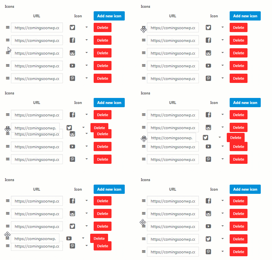
Rearrange Icons
You can always rearrange icons by grabbing the entire row by its left part (three lines icons). Then, drag and drop the row to the desired location.
Countdown Module
When you activate a countdown module, it will display a simple timer that will tick away the time until the launch (or anything else you want, of course).
The timer is editable, so you can change it whenever you need it – no data is stored in users’ cookies, so they will always see the actual version of the timer that you last saved.
How to add a countdown timer to a coming soon page?
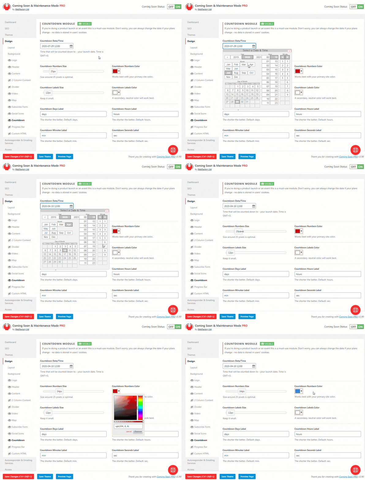
- Navigate to Settings -> Coming Soon PRO -> Design -> Countdown
- Click on the little calendar icon in Countdown Date/Time to select the date & time. The timer will count down to the selected Time, which is GMT+0.
- Choose the size of countdown Numbers and Labels
- Select the colors
- Change the text of the default labels if you want to (defaults are “days”, “hours”, “min”, and “sec”)
- Save changes
Progress Bar Module
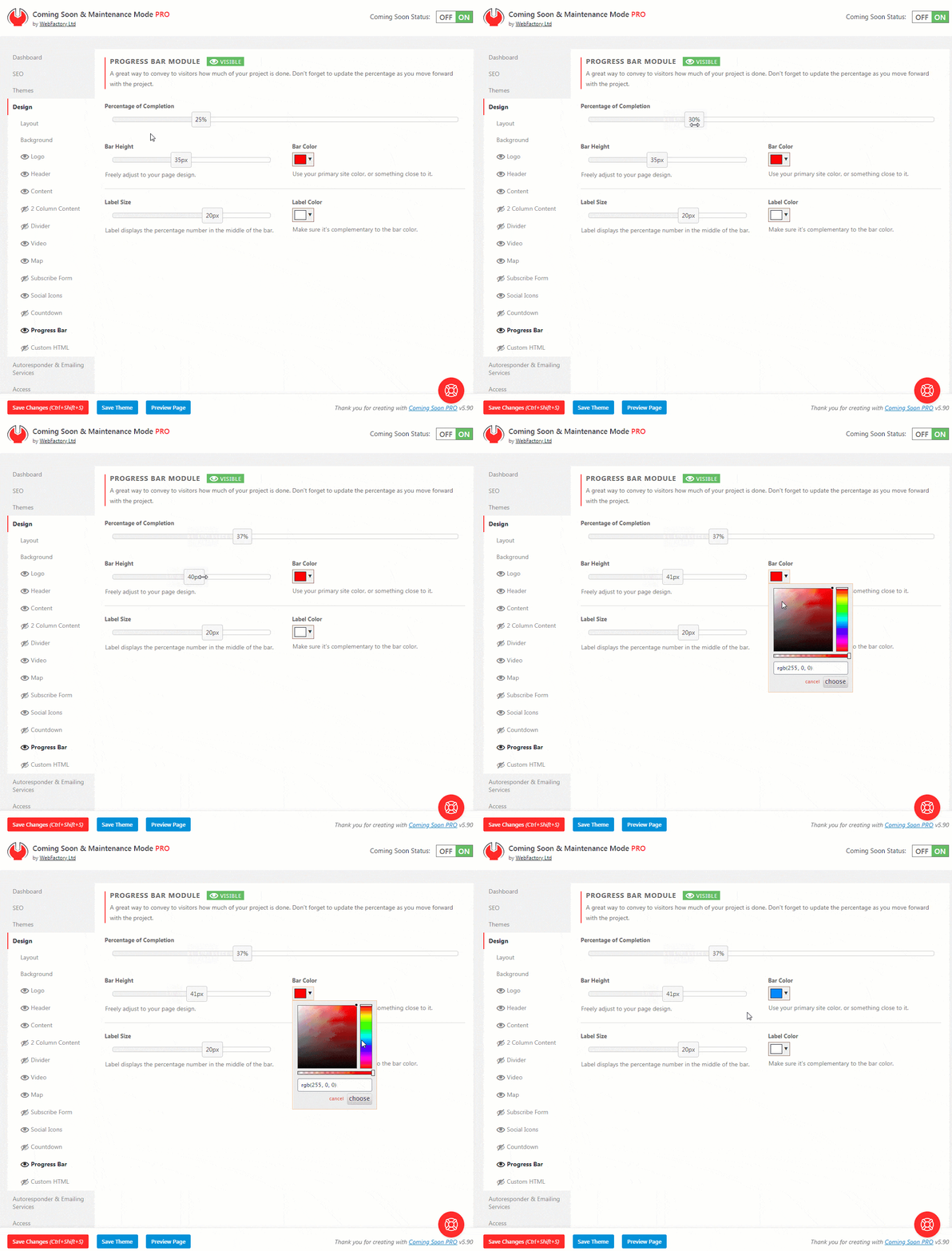
Would you like your first visitors to know about the progress of your website or project? There’s not a better module than a progress bar to show them a percentage of completion. You need to select the percentage, choose colors and dimensions, and the bar will be added to the page. It will even animate on page load!
Don’t forget to update the percentage as you move forward with the project.
How to Add a Progress Bar on a Coming Soon Page?
- Go to Settings -> Coming Soon PRO -> Design -> Progress Bar
- Move the slider to select the percentage of completion you want to show (0-100%)
- Choose the bar height in pixels (width is automatically selected, and it depends on the content width)
- Select the bar color
- Choose label size and color
- Save changes
Divider
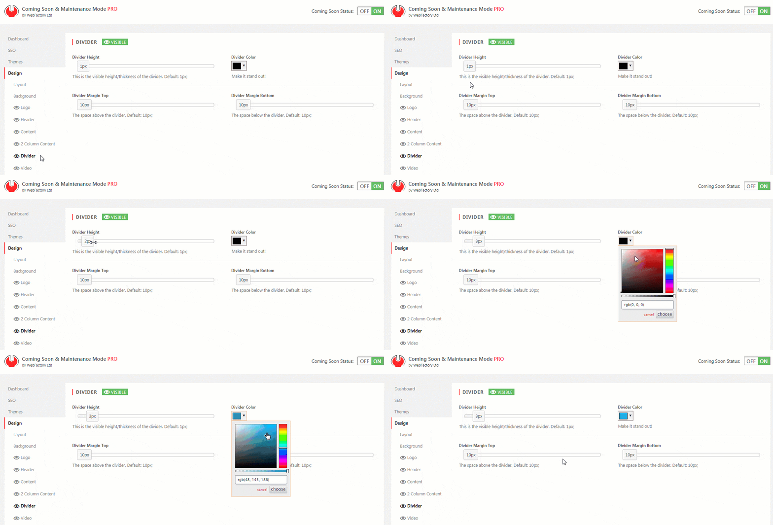
When you have more than a few elements on your coming soon page, we suggest adding a divider – a simple line that will visually separate two segments of your page.
How to Customize a Divider?
- Go to Settings -> Coming Soon PRO -> Design
- Select “Divider”
- Modify its height, color, and margins
- Save changes
Custom HTML Module
If a module is missing or you want full control over the page, this is the module to use.
You can enter any HTML code you want, which will be executed once the page loads. Make sure you double-check your custom HTML code.
How to add custom HTML to a coming soon page?
- Open Settings -> Coming Soon PRO -> Design -> Custom HTML
- Write your custom HTML code
- Save changes
The module is wrapped in CSS classes like all other modules when displayed: .html-container and .mm-module.
Use Custom HTML Only
If you enable this option, the plugin will ignore all other modules, backgrounds, or content settings and display only the HTML you provide.
Basically, you’ll get a blank template to work with. Basic CSS reset rules will be automatically added.
Documentation didn't help? Contact support!
Customers who purchased and have a valid PRO license - contact our support via the contact form built into the plugin or use the general contact form. If you're using the later method please include your license key in the message or contact us via the email address used when purchasing. This speeds things along.
Using the free version? We have you covered too. Head over to the forums. First look at older threads and if you don't find anything useful open a new thread. Support is community-powered so it can take some time to get an answer. If you need premium support this second - upgrade to PRO.