Coming Soon & Maintenance Mode PRO comes with 10 design modules that can be easily arranged on the page via a user-friendly drag and drop editor. The Layout editor allows you to move modules, and choose which one do you want to display on the coming soon page.
The Layout editor consists of two columns:
- Page Layout – a column which shows all active modules
- Available / Hidden Modules – holds all modules that you can use, but are currently inactive
In order to rearrange modules, simply click on a module that you like, and drag it to a place of choice. You can move modules up and down the column and choose their order, but you can as well drag them from one column to the other one and thus make one available or hide it from the page.
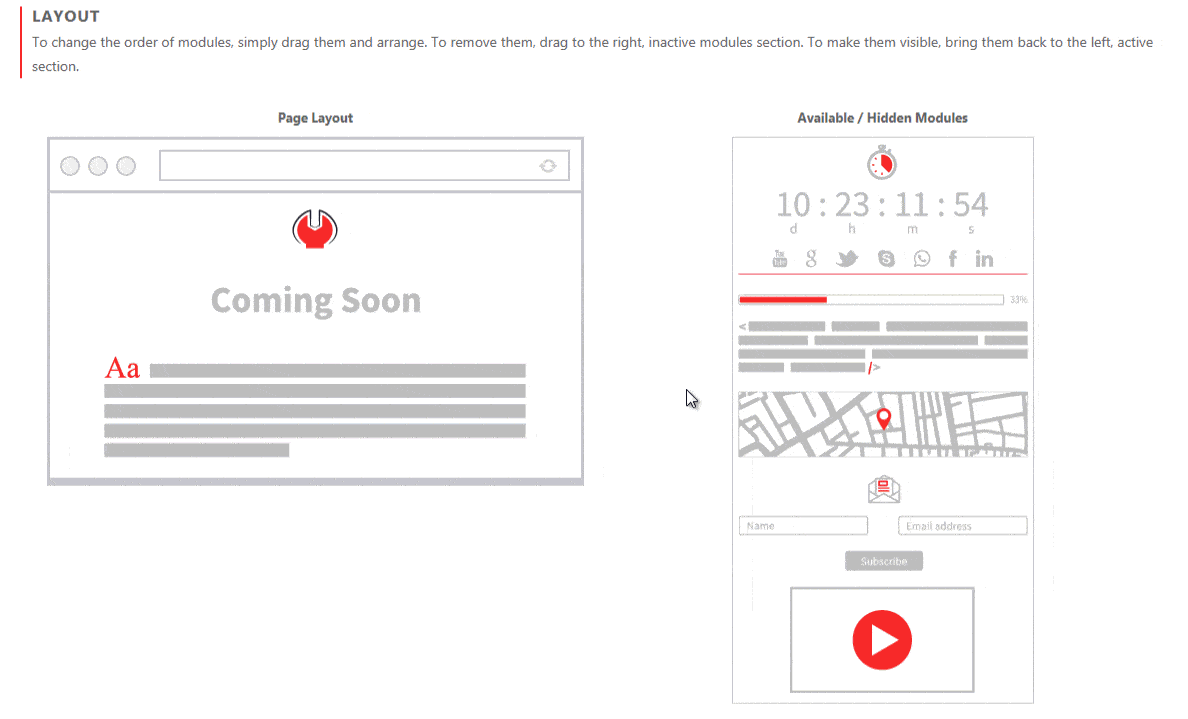
Page Layout
If you put the mouse cursor over any module, you will see a few icons pop up:
- Name – Label with the name of the module
- Drag&Drop icon – allows you to move the module (change the position of the element or move to inactive list)
- Edit icon – takes you to the settings page where you can customize details of that particular module
- Delete icon – moves the module to the list of inactive modules so you don’t have to drag and drop the element manually
Available / Hidden Modules
If you put the mouse cursor over any module on this list, you will see:
- Name – Label with the name of the module
- Plus icon – add the module to your coming soon page
Content Overlay
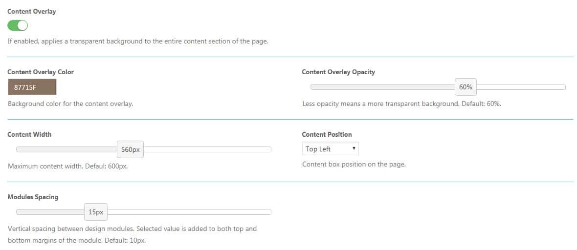
If enabled, applies a transparent background to the entire content section of the page. This background is used to put a focus on the content, and you can control its look by changing some of the following settings.
Content Overlay Color
Click to choose a background color of the content overlay element. You can as well write the color’s hexadecimal number.
Content Overlay Opacity
Move the slider left/right to change the transparency level of the content overlay element. Less opacity means a more transparent background. Default: 60%.
Content Width
Move the slider left/right to change the width of content that will be displayed on the page. You can choose width from 200px to 1040px in steps of 10px. Default: 600px.
Content Position
Choose the position of the content box on the page. It can be displayed in:
- Top Left
- Top Center
- Top Right
- Middle Center
Content Animation
With a simple click of the mouse button, you can choose an animation effect that will bring your content to life. Don’t worry; we don’t like to exaggerate things, so the animations are as simple as possible. They will affect the entire content at once which will animate as soon as the page loads in users’ browsers.
To animate content, simply select an effect from the list and save changes.
We know you’re interested in what it looks like, so please preview content animations or load one of our themes like Photography, Blogging or LEGO bricks. If you have opened the preview in a new tab and haven’t seen the effect, simply press F5 to reload the page.
Modules Spacing
The vertical spacing between design modules in pixels. The selected value is added to both top and bottom margins of the module. Default: 10px.
Documentation didn't help? Contact support!
Customers who purchased and have a valid PRO license - contact our support via the contact form built into the plugin or use the general contact form. If you're using the later method please include your license key in the message or contact us via the email address used when purchasing. This speeds things along.
Using the free version? We have you covered too. Head over to the forums. First look at older threads and if you don't find anything useful open a new thread. Support is community-powered so it can take some time to get an answer. If you need premium support this second - upgrade to PRO.