Leads are the lifeline of any business. Even when you’re showing a coming soon page, you should still allow people to subscribe and keep in touch. Make sure your form looks trustworthy. Configure technical details on the Autoresponder tab where you can connect MailChimp or any other Autoresponder.
Before you enable the module, make sure the form looks good. To help you with that, we added dozens of settings that allow you to change each and every part of the form without using code.
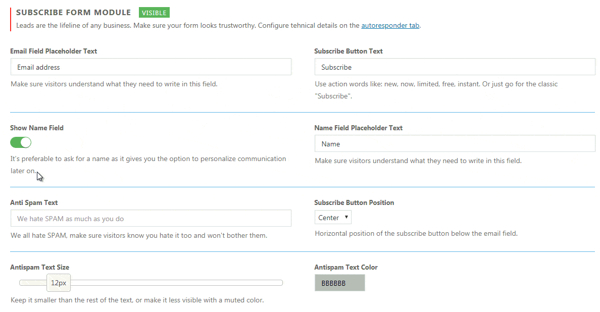
Leads are the lifeline of any business
Email Field Placeholder Text
Make sure visitors understand what they need to write in this field. By changing the placeholder, your visitor will know what you want from them.
Subscribe Button Text
Change the text that’s displayed on the subscribe button. We suggest action words like new, now, limited, free, instant. Or just go for the classic “Subscribe”.
Show Name Field
It’s preferable to ask for a name as it gives you the option to personalize communication later on. If you would like to show the field, simply enable this option and the form will get an extra field.
Name Field Placeholder Text
If Show Name Field option is enabled, you will be able to change the placeholder text for it. Write something like “Name” or “Enter your name”.
Anti Spam Text
Write a text that will let your visitors know that you are not collecting their emails to spam them. Make it custom and personal.
Antispam Text Size
Choose the size of the Anti Spam Text. We suggest keeping it smaller than the rest of the text or at least make it less visible with a muted color.
Subscribe Button Position
The horizontal position of the subscribe button below the email field. It can go left, right or center.
Messages Colors
Each response from the form can be colored. You can choose colors for:
- Success Message Background
- Success Message Text
- Error Message Background
- Error Message Text
- Input Fields Placeholder Text
Customize Form Styles
If disabled all form styles will be default (ugly) browser ones. Disable it if you plan on adding your own custom CSS to fully style the form.
Enable the option if you want to style the form. By enabling the option you will get the following options:
- Input Text Color
- Button Text Color
- Input Background Color
- Button Background Color
- Input Focus Background Color
- Button Hover Background Color
- Input Border Color
- Button Border Color
- Input Focus Border Color
- Button Hover Border Color
To change a color, simply click on the field and select a color from the color picker. If you want to make sure that some colors are the same, copy the color code (for example “215D3F”) and paste in another field. Don’t forget to save changes.
Documentation didn't help? Contact support!
Customers who purchased and have a valid PRO license - contact our support via the contact form built into the plugin or use the general contact form. If you're using the later method please include your license key in the message or contact us via the email address used when purchasing. This speeds things along.
Using the free version? We have you covered too. Head over to the forums. First look at older threads and if you don't find anything useful open a new thread. Support is community-powered so it can take some time to get an answer. If you need premium support this second - upgrade to PRO.